Gym Spotters
Overview
Brief:
During a four week sprint, create a wellness app to explore how our client can leverage technology to help people live a healthier life.
Project:
Initial research indicated users were most interested in pursuing wellness through exercise and fitness, but struggled with movitation and accountability.
Using the initial data, and keeping the client’s goals in mind, we continued to research and eventually developed Gym Spotters, a workout partner matching app, to help users meet their workout goals and attain a healthy lifestyle.
Roles:
UX Research
Project Manger
Information Architect
Research
Survey and Interviews:
We started with a survey to gauge interest in matching workout partners.
We learned users would be interested in working out with a partner whose experience level, workout goals, mode and other fitness habits, matched theirs.
Our interviews focused primarily on learning more about users current gym habits and preferences for partner matching.
As we reviews the results, we began to see what mattered most to users for matching with the right partner and finding motivation.
Goals:
Meet people who have similar fitness goals
Give and receive motivational support to workout partners
Pain Points:
Doesn’t know anyone at local gym
Not sure how to find someone who matches their fitness goals
Competitor Analysis
Feature Comparison:
We completed a feature comparison of a variety of apps, some focused on workouts, like Nike and Class Pass, and others, focused on social interactions, like Bumble and Play City.
From these we learned we needed to incorporate:
Etiquette and guidelines for interacting with others in the app
In-app messaging, so users can feel safe talking to others without sharing personal information
Advanced profile settings and filters to create matching
Market Positioning Map:
The market had an open spot for a workout app which provided a social connection and workout services.
Ideation
Job Stories:
We began to ideate by writing Job Stories, from the user’s perspective, to capture their needs, in a variety of situations
User Flow:
We then created a simple User Flow, illustrating how a user would create their profile, set their filters, and begin matching with partners.
Wireframes
Lo-fi Concept Sketches:
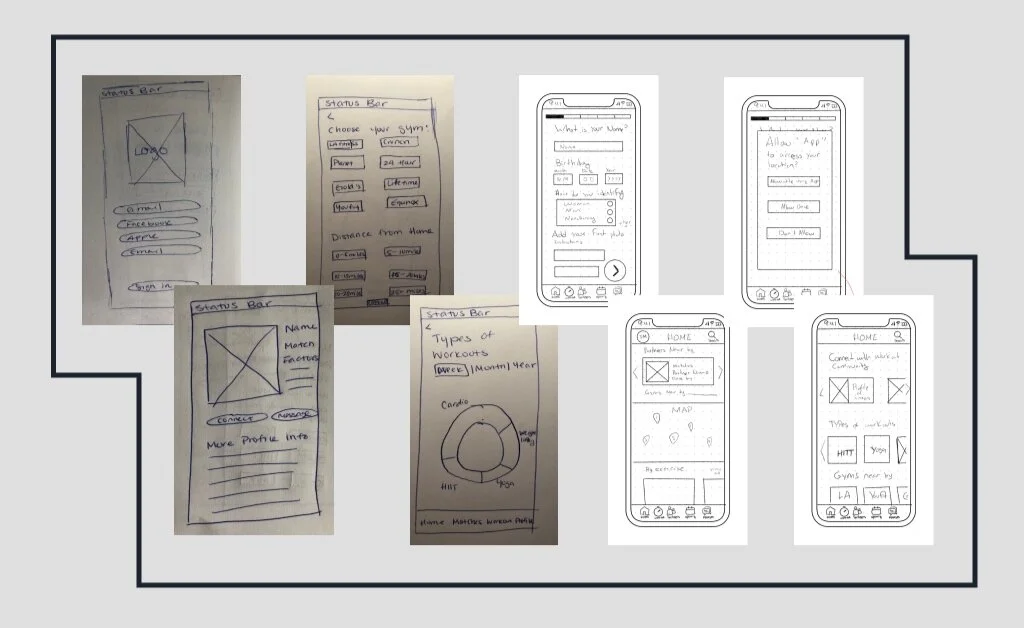
Drawing inspiration from our Feature Comparison and keeping our User Flow in mind, we began sketching.
Mid-Fi Wireframes:
Once our sketches were completed, we built a mid-fi prototype of the flow, and began User Testing.
Testing revealed users like the concept for the app and found the flow easy to follow but wanted more specific features including:
In-depth filters for the workout partner matching process
Explanation of location sharing
Specific workout time options
Visual Design
Visual Competitive Analysis:
We conducted a Visual Competitive Analysis with the apps we had previous used for our Feature Comparison, noting their use of white space, pops of color and photos.
Moodboard and Style Tile:
Next, we developed and tested a Moodboard, using the board itself and the feedback from testing to inform our Style Tile and brand attributes. Moodboard testing revealed users felt represented strength, fitness, teamwork, motivation, partnership, and hard work. Though these were not an exact match for our brand attributes, these were similar and embodied the same sentiments.
Hi-Fi Prototype
Partner Filters:
When creating or editing their profile, users have the opportunity to set criteria for matching with partners, including workout goals, types of workouts, and preferred workout times, among others.
Matching:
Once a user has set their filters, they can begin to view their matches, categorized by which criteria they fit.
Workout Invites:
Once a user finds a partner they are interested in learning more about, they can view their profile page, see their workout schedule, and send an invitation to workout within the app.


